I got an iPhone, which replaces several of the items I had been carrying with me everywhere: my iPod, small camera, and phone. The camera aspect leaves something to be desired, but does give me some flexibility to grab a shot when I see it. So my small travel camera is now in my desk drawer, and the small iPod in my gym bag.
I find this shot simplistically satisfying. Simple vanishing point, primary colors, high contrast. Might have been more interesting if the train were moving. The iPhone with it's small lens and lack of flash, generally has a long "exposure" time, so movement can be captured.
This is the blue line at Aquarium in Boston.
Saturday, February 21, 2009
Saturday, February 14, 2009
Mbira
This is a somewhat abstracted sketch of an African instrument called an Mbira. It's one of my favorite drawings. I particularly like the composition and the asymmetry of the "buttons" on the bottom. (In reality, they are bottle caps nailed on to the instrument to add a percussive quality to the finger-piano sound.) This was done on the same day as the cello.
You can see the instrument as it appears in the Boston MFA collection here. As you can see, the composition was the instrument-maker's, not mine.
I find that others are frequently indifferent to this drawing, and yet I've returned to it for inspiration several times, and I find myself repeating that pattern of buttons unconsciously, often echoing it with the arrangement of nine objects in a composition in another medium and with other objects.
PS: Listen to the sound of this on the MFA site. The piece they have, played on this instrument, has a repetitive quality that reminds me of the repetitive quality that this drawing has had for me. I love when themes are echoed and repeated with improvisation, whether in art, music or life.
Thursday, February 12, 2009
Cello
Sketched at the MFA in Boston. I don't even remember sketching it, although it was in with some other instrument sketches I had made one day a while back. I'm sure it was not meant to be a cartoon character. If Prosopagnosia is the term for the inability to recognize faces, what do we call it when we see faces everywhere? We're so wired for recognizing faces we see them where none exist.
So speaking of the cello, I heard a third-or-fourth-hand story about a Boston area cop who pulled over a famous cellist. Returning to his precinct office, he announced "What the hell kinda name is Yo-yo? Who names their kid yo-yo?" His fellow officers filled him in.
And speaking of Yo-Yo Ma, I've heard some criticism of the piece played at the inauguration (derivative of Copland, too simple, not classical enough, not Hollywood enough etc.) but I found it to be lovely.
Thursday, February 5, 2009
Tuesday, February 3, 2009
Chihuly Installation at Desert Botanical Garden, Phoenix
I spent several hours exploring the exhibit, going from broad daylight to dusk to darkness. Really a stunning exhibit. Full sun:
For photos of entire pieces, see the exhibit description. I tend to be more interested in details or context-free compositions, yet I like the photo above because it's showing a detail of the piece, and yet the full context of the piece.
This one catches the desert light as the sun begins to drop toward the horizon.
This was all done with a little point-and-shoot auto-focus digital camera. No polarizing lenses, no star-effect lenses, nothin'. The light is really that spectacular.
Tuesday, December 9, 2008
Plate of Shrimp
Ah, yes, another hydrant. One of the earliest ones. Just a pencil sketch of the hydrant you can see from the porch at the summer place. The same one as in that painting I posted a while back. And about a month back, while walking to the train, I came across this:
I grabbed my little traveling camera from my bag and took a couple shots. A worker came running up to me, telling me it was nothing interesting, they had shut off the water. I tried to tell him it was interesting to me, but finally just said "It looks cool." He gave me every indication that he thought I was a kook without actually speaking and walked away. Then I got this shot:
Fans of Repo Man will recall the plate of shrimp phenomenon. And really, this whole post was just to bring up Repo Man, which I loved but probably haven't seen since the 80s. I think I'll add it to my netflix queue.
Wednesday, November 12, 2008
This is not a great drawing...
and yet I find it pleasing on quick glance. Why is that? It's a sketch from a set of quilt design ideas in one of my sketchbooks, and looking through them I was struck by this one.
When sketching, I thought about the strip quilt process -- sort of a loose log cabin, where the quilt is built up by strip sections rather than carefully measured squares -- and built up the drawing similarly.
There's no golden ratio or nice spiral here, and yet the proportions seem right. How do we judge that, internally? What... oh wait. Maybe there is a spiral shape - but it's in the shapes darkened, rather than the large-blocks-to-smaller-blocks that were the "spiral" of how I built up the drawing. So I somehow imposed a spiral after the initial drawing was laid out without really thinking about it. Cool.
(It also looks a little bit like Cape Cod, but the red shape at the top right would have to curve or be cut down a bit - Provincetown doesn't go that far into Cape Cod Bay!)
If I think too much about all this when sketching, the sketches turn out like engineering drawings. Neat, but without life. It's almost as if the aesthetic pleasure is diminished if the rules are adhered to too closely.
I wonder if that's measurable. Could an experiment be devised where subjects are asked to evaluate the pleasingness of a set of abstract shapes generated by computer to conform to strict proportional rules vs similar shapes that break those rules by some degree?
Saturday, October 25, 2008
Work in Progress
I'm experimenting with using a palette knife and acrylics. I'm not diluting the acrylic, so it can really bunch up under the knife. I like the textural effect, but stepping back it's a lot of shades of gray. It's a good first and second layer, and I'm reasonably satisfied with the composition, but I'm not sure where to go from here. I do like the flat graphical effect, and don't really want to impose depth on the painting, but it needs contrast. Maybe just another layer of the same palette knife effect with contrasting colors or brighter versions of the colors already down.
Wednesday, October 22, 2008
Brush and Ink
Do we see more in art when we feel we have less control? See this study on control and order.
It's not about art, but I'm curious how it might apply.
(Brush and ink on paper, 2008)
Monday, October 20, 2008
3-D Silhouette
Friday, October 3, 2008
Dogfight
A wordless narrative. Click on the image for a larger view. Do you see an order to the images? What story does it tell? No, this isn't copy from a typical poorly written, Texas BoE-approved textbook. This could fall under many genres: comic book, time-based art, movie stills, simple photography. I'm interested in your reaction. What is the story told here? Is there a story at all? Metaphor? Theme?
Thursday, September 25, 2008
The Dolls - DeCordova Museum, Lincoln, MA
I like how this turned out. It looks contrived, but this image was shot as found, a child's dolls thrown haphazardly on the grounds of the sculpture park at the DeCordova. Should I crop out (or photoshop out) the shadow on the bottom left, or leave it?
Thursday, September 11, 2008
Man with a Hat - Munich
The first time I noticed the term "happy accident" was during a drawing course at MassArt. I'm not sure how I had missed noticing such a great phrase prior to that. This photograph was indeed a happy accident, as I was trying to frame the wonderful second floor entrance to a Munich apartment when the gentleman in the foreground stepped into the frame.
Friday, August 15, 2008
Kites, Tel Aviv
Wednesday, August 13, 2008
Thursday, July 24, 2008
Saturday, June 7, 2008
Sunday, June 1, 2008
Scarf
I took a lot of shots of this silk scarf, trying to capture the movement of the scarf in the wind of a late spring day. I was trying to capture the feeling of being suspended in a calm moment in time, the childhood feeling of having a whole summer ahead and your time open and free. (Do any kids get that wonderful feeling anymore? Or are their summers so scheduled with activities that they never get to experience those wonderful childhood moments of being lost in an activity with nothing to stop them?)
Sunday, April 27, 2008
A note about canola oil...
Sketchbook Numbers Quilt
Maybe it's time for open source fonts. After I typed that, I remembered "google first" (today's RTFM) and realized of course there's a lot of thought around that, and in exactly the direction I was thinking. More variety of fonts available more widely for web design.
Of course, even after solving the problem of ensuring the font you want is on all systems (even microsoft), ya gotta ask: Do we really want more fonts available? Aren't most websites ugly enough?
I have a long-held prejudice against a layout containing more than maybe two typefaces. When I was in gradeschool, I'd often stop after school at our small town weekly, where my mother might be laying out the paper. She'd be standing at the layout table, holding her "scalpel" (exacto-knife), moving articles and ads around with a very literal cut-and-paste technique. She'd grumble about some of the pre-designed ads that would come in which were "messy" - too many words, too many typefaces, too crowded, too ugly.
I'd listen to her while copying letterforms out of a linotype typeface catalog with a blue mark-up pencil.
She made me love simple designs with well-chosen typefaces.
Sunday, April 20, 2008
Babydoll Blankets
When I was little, my grandmother let me take small pieces of fabric from her scrap basket to make "babydoll blankets". I sat on her lap at her sewing machine and pieced together scraps of polyester doubleknit (hey, it was the late 60s). I didn't call it piecing or quilting, and we certainly didn't consider it art. It was the beginning of my love of quilts, and the whole idea of making something beautiful from the leftovers.
Pojagi
Twenty years ago I visited Korea with a friend. Although I came away with a love for Korean food and the beauty of the countryside, I did not discover Korean patchwork then. Pojagi is a Korean patchwork craft that is used to make wrappings. Chung-hie Lee is a Korean fiber artist. Here she is at RISD.
Narrative vs Non-narrative
The part of our brain that makes us most human, the frontal cortex, is the part of the brain in charge of narrative. There's such a need to create a narrative cause-and-effect that we sling together the random images from memory consolidation into dream narratives. ("I was standing at the edge of a lake, then suddenly the lake became a glass path and I walked across it and into a grocery store, but the shelves were full of plastic animals...")
I'm curious about how different parts of the brain respond to narrative and non-narrative art. Is there an innate human response to representational art that makes us create a narrative around the work? ("Who put the bowl of fruit on the table? Why is the girl in the dress on her hands and knees so far from the house on the hill? Why are the old people with the pitchfork frowning?") Why is explicitly narrative art seemingly more accessible? Renaissance painters like Titian or Botticelli still spark discussion about the narratives of their paintings, but so-called "starter art" such as Norman Rockwell is accessible precisely because of the narrative content of the images.
How does the response to non-representational art differ? Why is it harder for adults to adjust to? ("Gee, Marge, anybody could throw and drip paint around like that. I can't believe it's hanging in a museum!") I say adults because children don't seem to have difficulty accessing Pollack or Rothko or de Kooning. Is that because the dorsolateral prefrontal cortex, which has been shown to inhibit spontaneity (see this article), is less developed in children? Does the extent to which the brain "edits" affect the response to art, as well as the creation of art?
"What're you lookin' at?"
So I know painting pets can be cutesy and cliche, and this may well not be an exception, but for me, the challenge is to move away from a drafting, engineering drawing style and into a looser exploration of color and movement. And if you look around me seeking movement, you can't miss the wiener dogs.
Saturday, March 8, 2008
Friday, February 29, 2008
Curtains
Thursday, February 28, 2008
Friday, February 15, 2008
Monday, February 11, 2008
Three steps
...or three states. Solid, liquid, gas. No plasma in sight, however. (And what's jello, anyway? A solid? Oh, no, wait... it's proteins suspended in liquid. Colloid. Although when I was growing up it was canned pineapple suspended in lime green jiggles.)
As for the image, I liked the contrast of the rocks to the water, and the stark shadows versus the somewhat out-of-focus water.
Wind
Click to Play
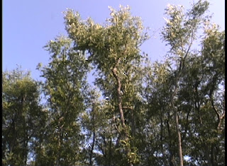
The windchimes aren't a separate audio track -- they were in the moment, yet to me sound like another layer above the sound of the leaves. If it were a longer clip, I think the audio could work alone. To me, it's very calming.
Subscribe to:
Posts (Atom)